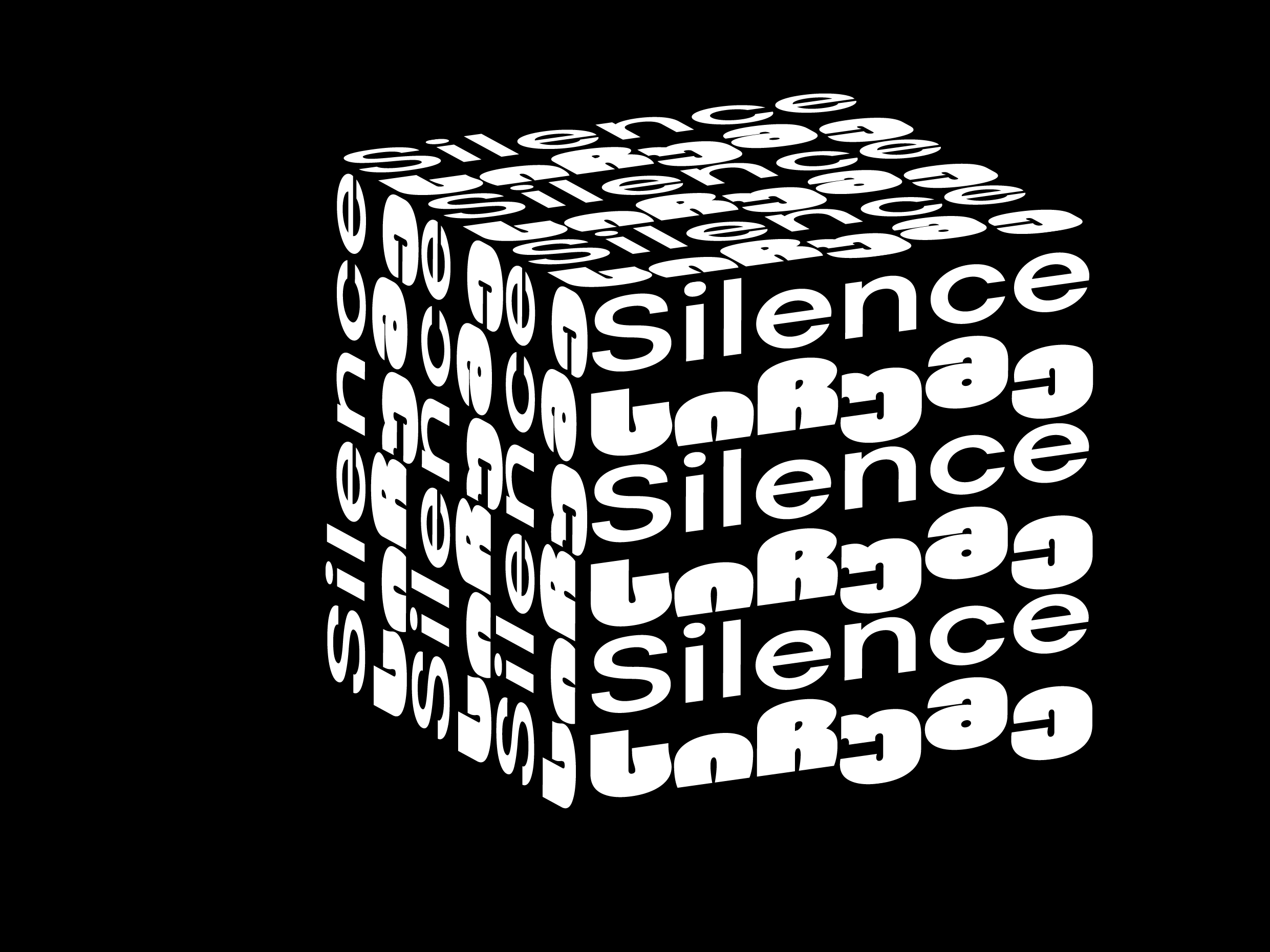
Typographic Harmony: Music Festival Posters
Black-and-white minimalist designs communicating sound through typography
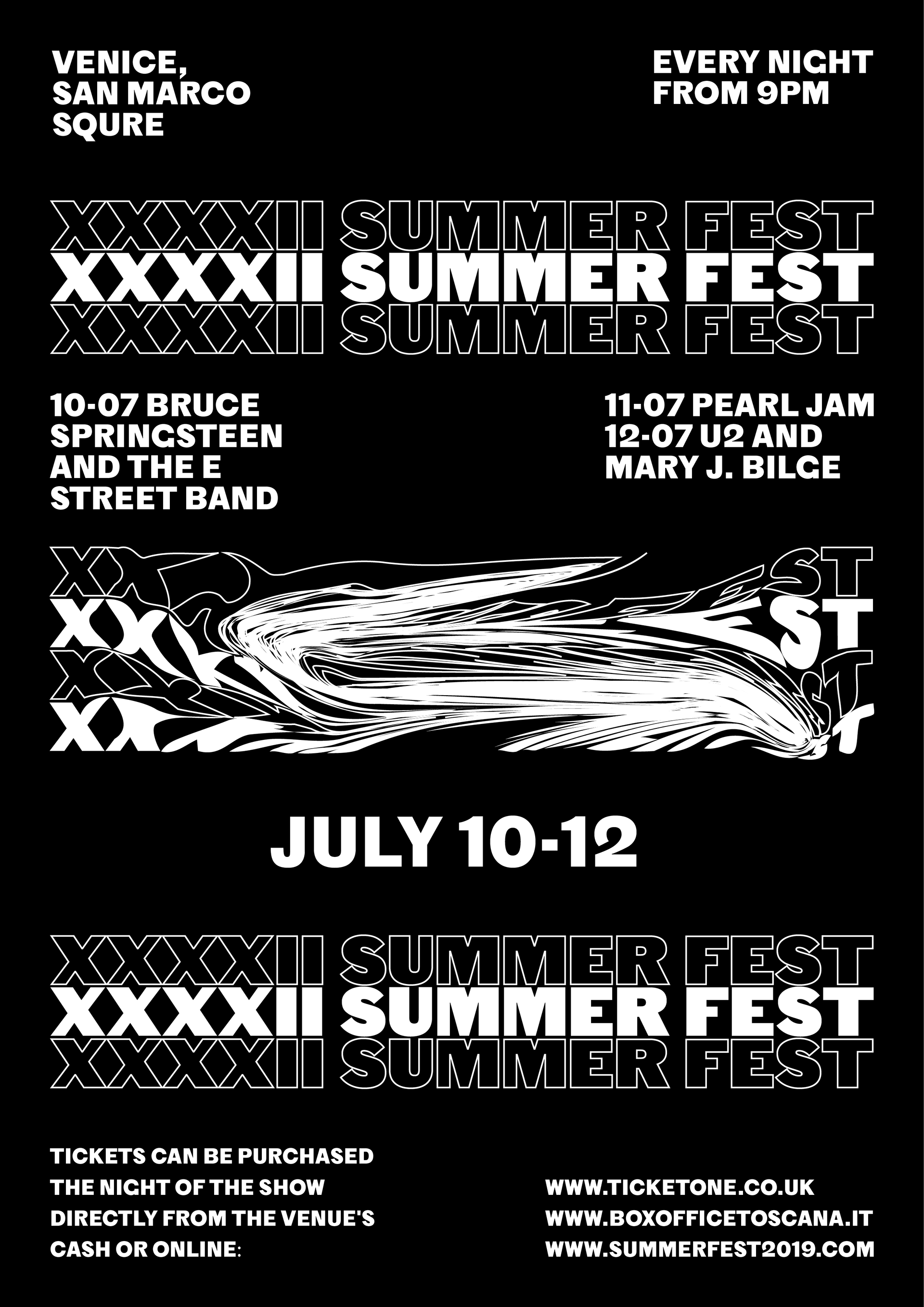
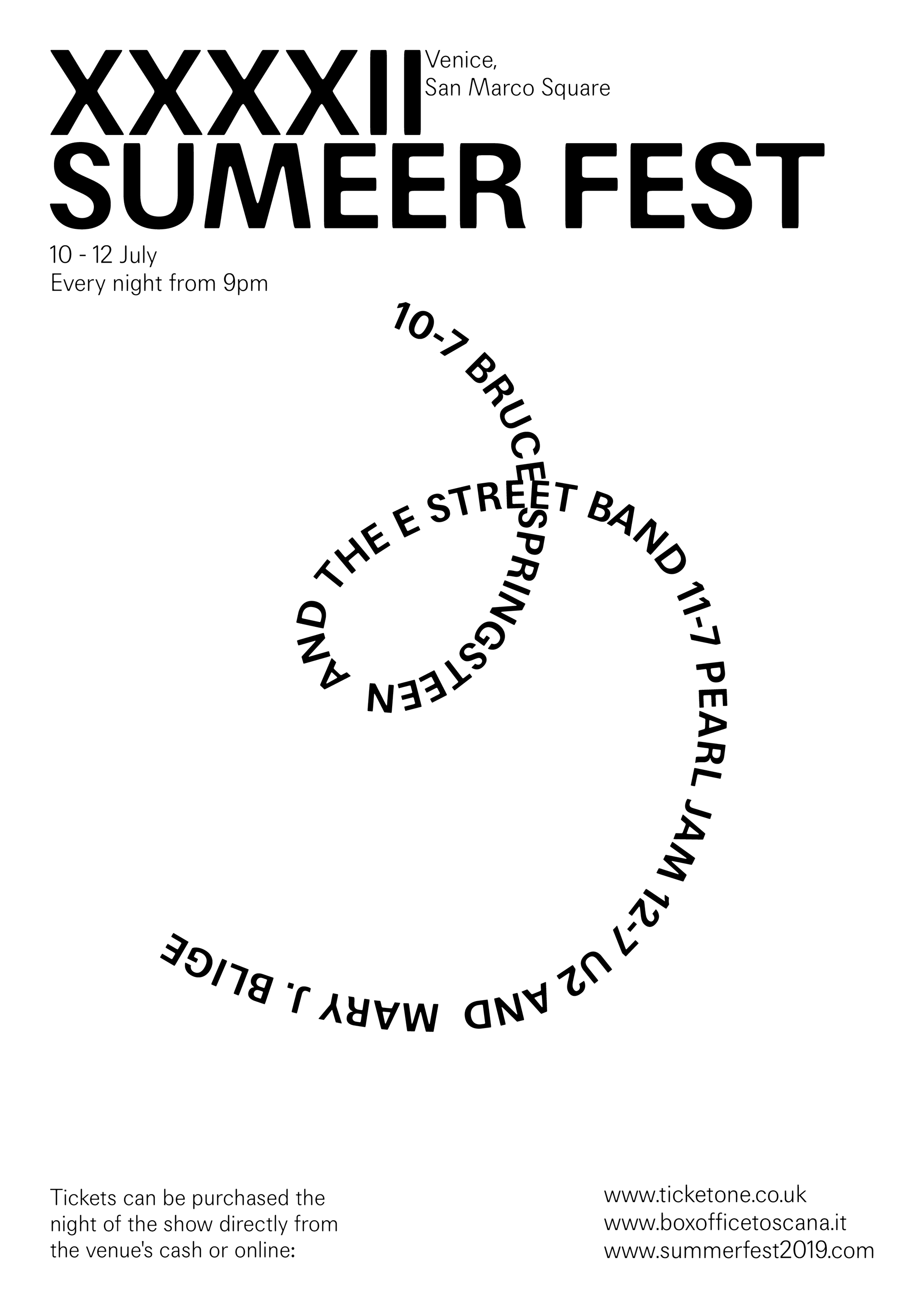
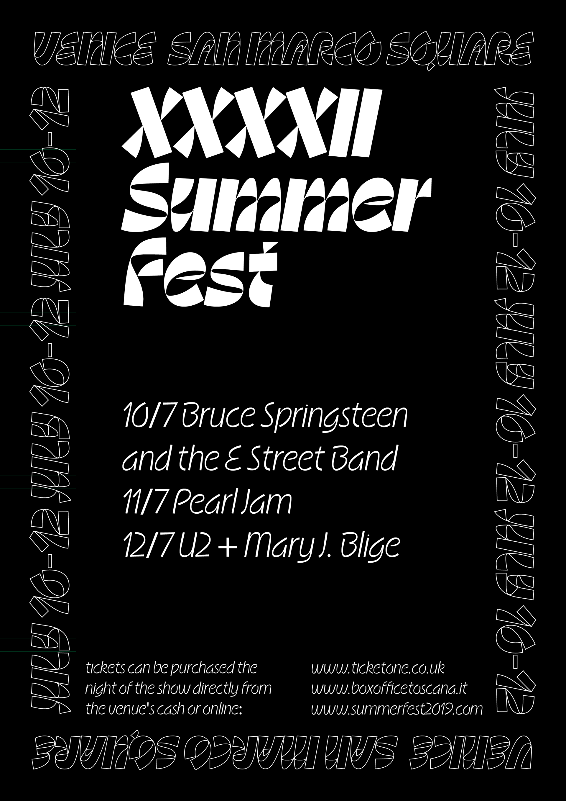
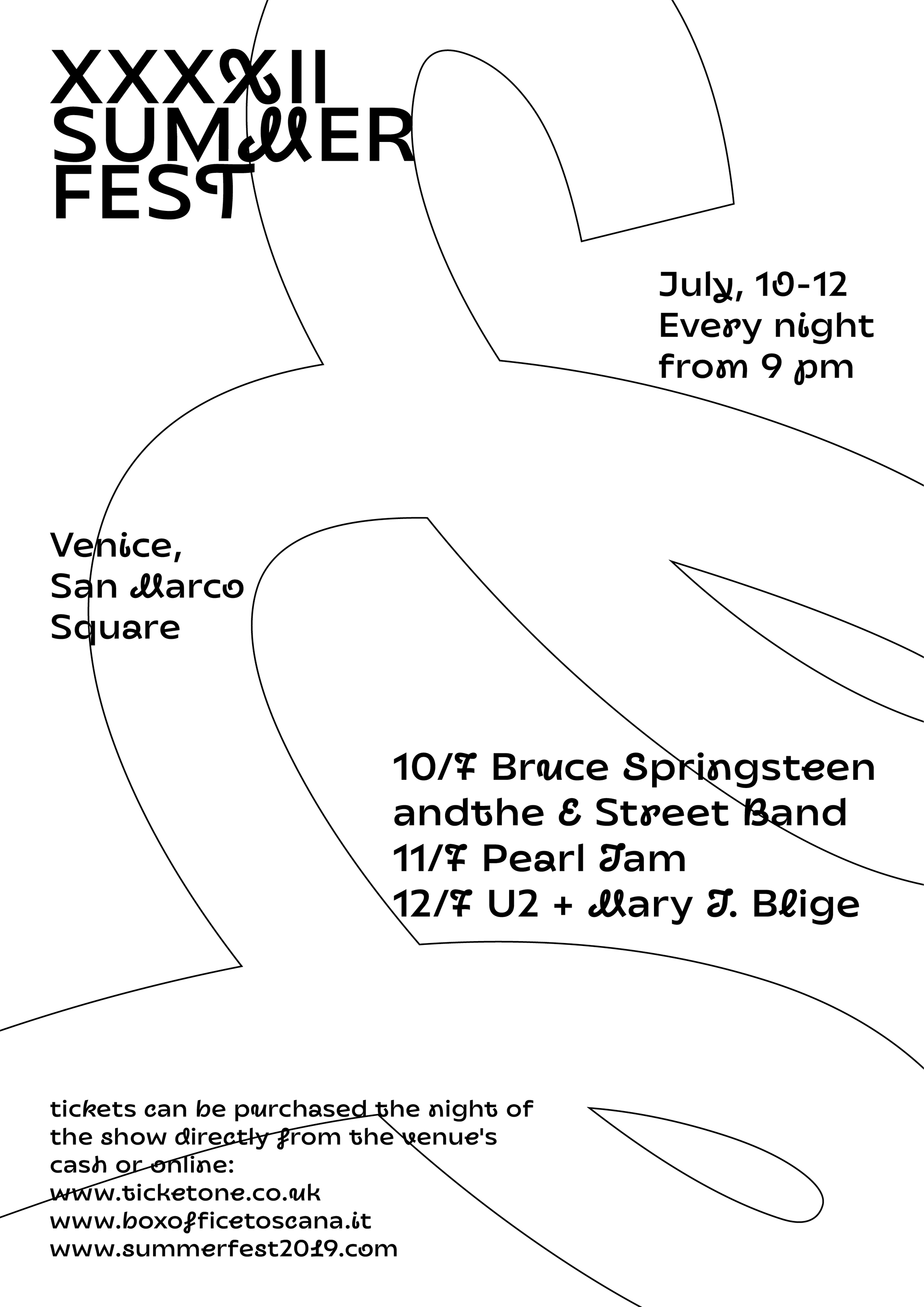
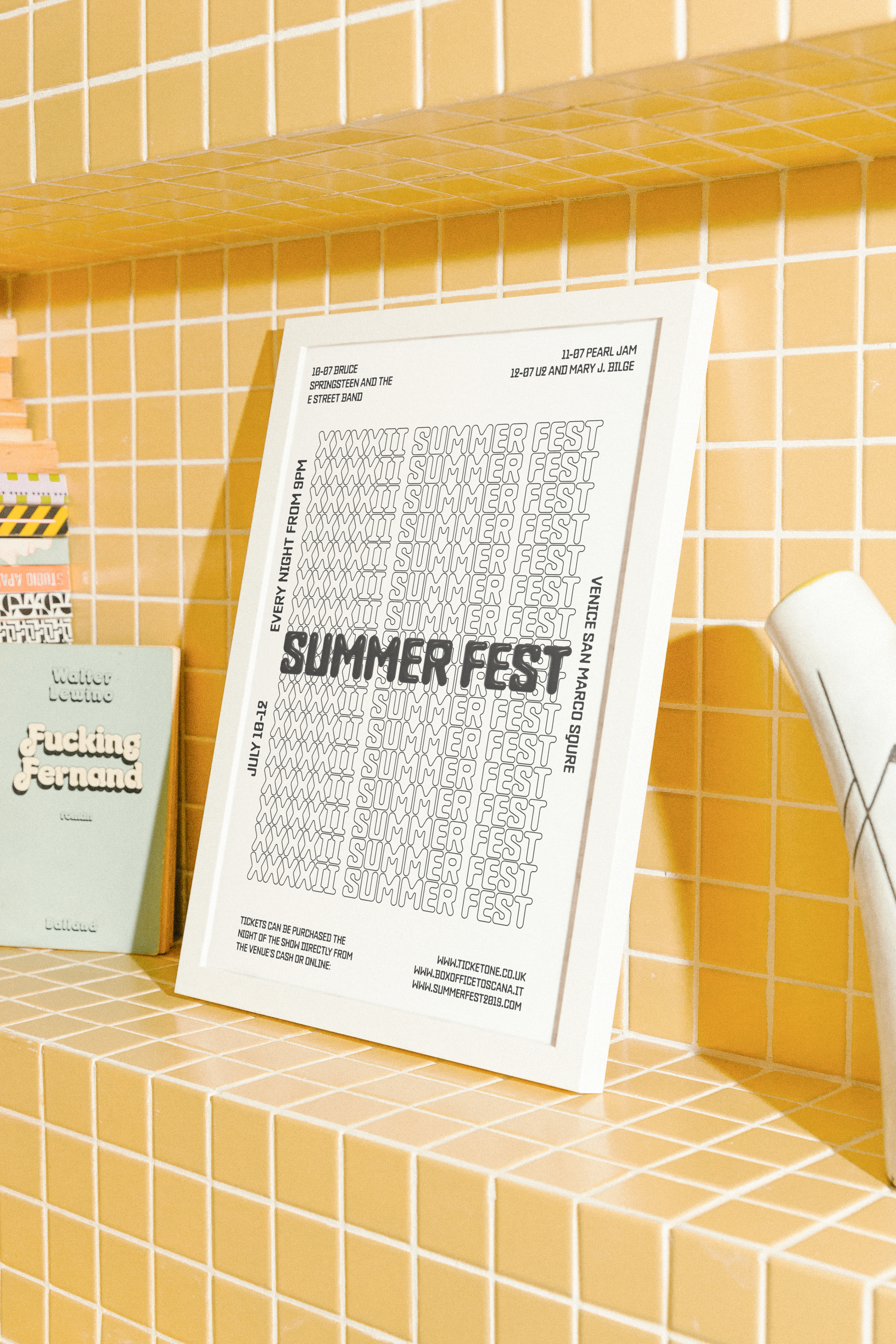
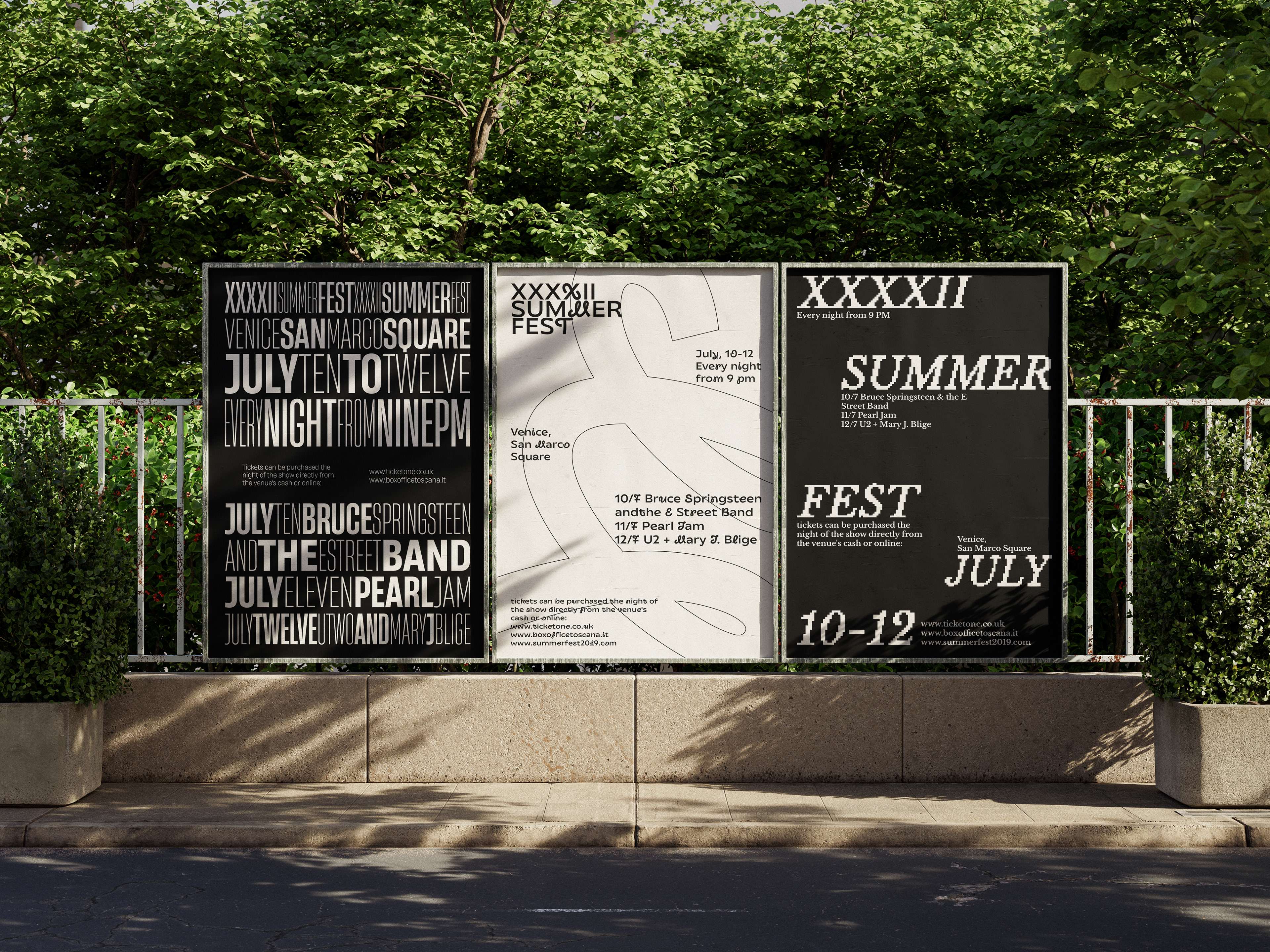
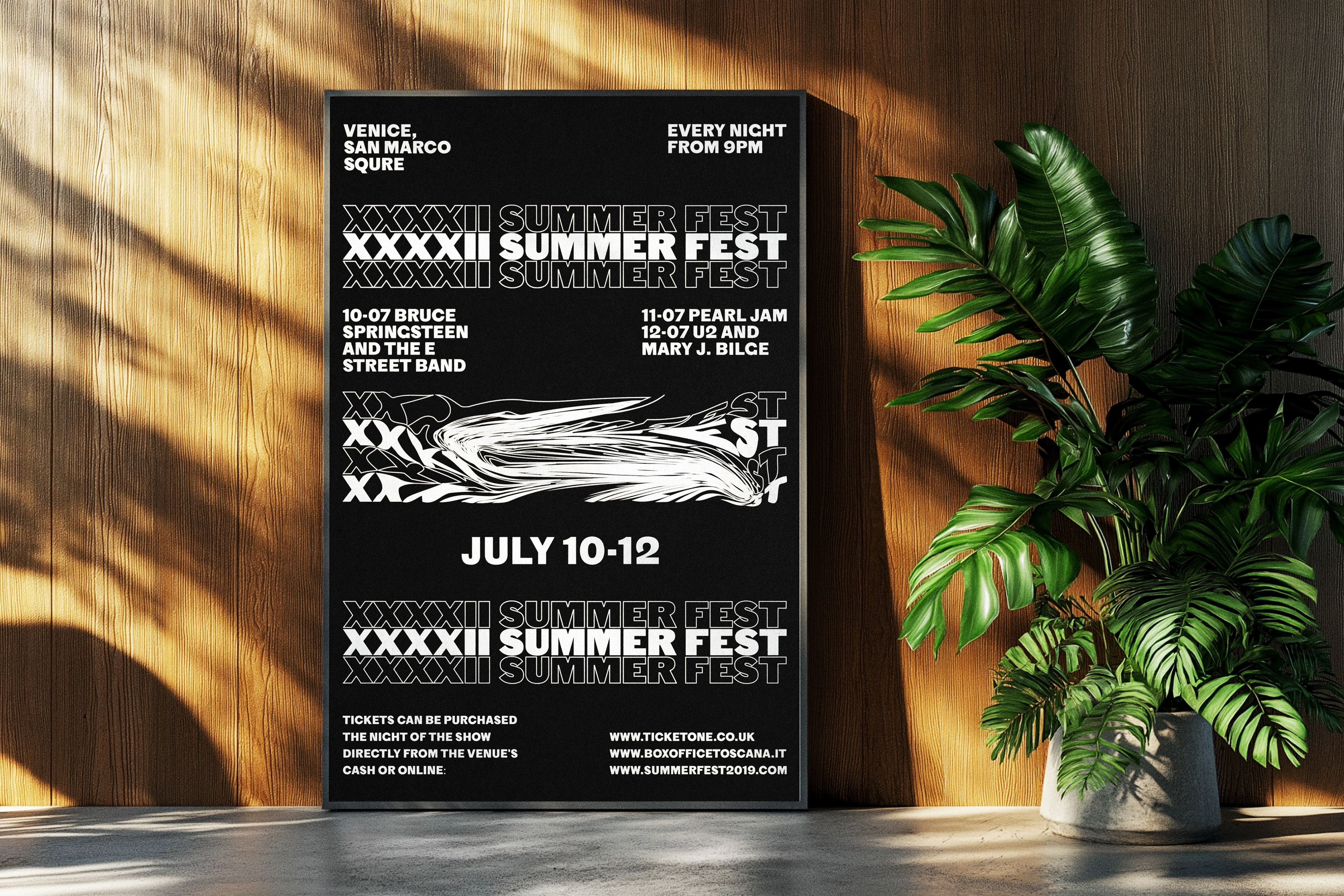
This series of posters was designed for a music festival, focusing solely on typography and a monochromatic palette. The challenge was to communicate all essential festival details, including dates, venues, and headliners, while maintaining a bold, minimal aesthetic. By leveraging typography as the sole visual element, the posters create a striking yet functional design that captures attention and conveys information clearly.
Key Highlights:
Concept: Black-and-white typographic design emphasizing clarity and impact.
Challenge: Communicating complex festival details through typography alone.
Outcome: A cohesive series of minimalist, high-impact posters.